An in-app coupon's page for Walmart
AIR Canada
This is a 3 days, 9 hours case study based on The Design Sprint for Air Canada by working the Publicis Sapient and Air Canada. to make Air Canada a top of mind choice for travel research and discovery.

My Role:
Interview, User Testing, Icons/vectors Collecting
My Team:
Andrew Pieroni, Elizabeth Ko, Ana Hall, Brookly Van Dyk, Ryan Thiffault, Anoop Shreedhara, Chery uguyen
Tools Used:
Sketch, Invision, Adobe PS, Adobe XD
�Timeline:
July 22 2019 - July 24 2019
Research Insights
-
91% of North American travelers look for deals when deciding to book a trip
-
Less than 5% of Air Canada visitors engage with promotional content on the homepage
-
1 in 2 Air Canada visitors search for at least 1 flight during their session
-
40% of users cite price as the most important factor when booking travel
Day 1 - Gather Information & Sketch
Stakeholder Panel
During the stakeholder panel interview, we invited key stakeholders from Air Canada to help us understand the insights for Air Canada website. We wrote down “Help me with” on sticky based on stakeholder's presentation, then categorize it on the whiteboard as opportunities, competition, personalization, and loyalty.


The Problem
Make Air Canada a top of mind choice for travel options and book directly rather than through an OTA.
Opportunites
-
Consistency across devices
-
Focus on discovery and research
-
Convert new customers through "Starter" loyalty program
-
Simple search
Lightning Demo

Gathering Key findings and identify solutions from a variety of websites including: Fantasy, Poter, Kiwi, Skiplagged, Google flights and Hopper etc.
Sketching

Each of us in the team did a quick low fidelity sketch in 2 hours, 3 people did sketch for mobile and 4 people did sketch for desktop.
Day 2 - Decide & Prototype
Critique and vote


Each of us has 5 dots and 3 stickies, we need to put down the dots on the sketches we like and write on stickies about what we like for that sketch.
We decided on the desktop sketch by various combining features from all the sketches.
Prototyping:

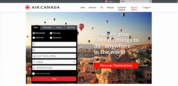
Original Air Canada main page
New Air Canada main page
Given that we want to make Air Canada as one of the top of mind travel search websites. We decided to focus on the main page by adding "Discover Destination". To give the user more explore options based on customization.

We only had 3 days, 9 hours from research to testing. Therefore, we only finished the "Discover Destination" page, give users customize budget, destination and duration options as well as give them a visual map for destination and duration. They can view it in either map or list.
Day 3 - Test & Present
Objectives:
-
Does this feature cater to casual customers?
-
Can users research and discover destinations?
-
Does this make users consider booking with Air Canada directly?
User testing
Home Page - Explorer

Testing question
-
What do you think about this screen?
-
What would you do here?
-
If they click on a non-functional thing. Why would you click there?
-
If the user clicks on discover without guidance. Why would you click the discover button?
-
lead the user to click the discover button

Feedback from Use
-
Clicked offers for discount
-
Will look up location first
-
Discover is a good indicator
Questionaire Page


Testing question
-
Is this something you were expecting to see?
-
If the user thinks NO - “Explain what you thought you were going to see here”
-
Where do you expect to go from here?
-
Go ahead and choose what you would like?
-
What do you think about the questions?
Feedback from User
-
Not expected, but pleasantly surprised
-
Went through questions really fast
Results Page


-
What do you think about this screen?
-
What did you expect to see here?
-
What would you do here?
-
What do you expect to see when you click on an option?
-
Expected local flights
-
Duration is really important
-
User will look at location, price, and distance for flights
-
Dropdown menu for price would be good
-
Liked the "list" option
Wrap up Question
-
How was your overall experience using the feature?
-
Do you think this is a good tool to discover and explore?
-
Do you think this is something you want to use again?
Testing Insights:
Home Page - Explorer
-
Enjoyed Visual Impact of the page
-
CTA needs refinement (they thought it leads to blog article)
-
2 users used top bars
-
Guide user to discovery through social media and other channels
-
No one used "offer" entry points
Questionnaire Page
-
Enjoyed budget question
-
Liked simplicity (Clean and straight forward design)
-
Would like more options for the questionnaire
-
Pleasantly surprised at the experience
Results Page
-
Eager to know more information
-
Pleasant surprise to see it visually
-
liked the options of "map" vs "list"

